@adlrocha - Sharpening my web-weapon
Efficient web development for client devices: Adaptive Lerarning, Server-side Rendering, and Minification

Since my recent “Software Disenchantment”, and the unavoidable fact that we need better programmers as we are approaching the limits of computer power, I committed myself to understanding all the underlying processes of the code included in my implementations (no more blindly copy-pasting pieces of code from StackOverflow, or using inefficient libraries just to parse a simple JSON file). In order to write sustainable code, one needs to understand what is happening under the hood (even if that means being able to reason about hardware when you are building a web application).
I started this quest towards “sustainable software development” (or this is how I decided to refer to it) last week, when I went deep into Javascript, NodeJS and Buffers. Today I want to explore the use of other schemes to develop more efficient web applications.
Adaptive Loading

This article about Adaptive Loading was the one that gave me the idea of exploring more efficient ways of building web applications. It also opened my mind about several things: I am a backend engineer to the core, so I wasn’t used to worry about client’s performance (when it is actually the one that matters the most). I was more bothered by the consumption of my infrastructure, and being able to accommodate a high-load of users seamlessly with a low AWS bill at the end of the month. But users interact with applications through a client frontend using a device, and not every user has a 2016 iPhone 6 with 4G like me, but a 4K TV, a laptop, an iMac or a 2010 Blackberry with 3G. And, of course, we want all of them to be able to use or application and give them the ultimate experience.
To solve this problem of developing sites for high-end devices which are unusable for most low-end ones, someone came up with the Adaptive Loading web performance pattern. In short, with Adaptive Loading what we are going to do is to adapt the version of the site being served according to the specifics of the device requesting it. This pattern is based on:
Delivering a fast core experience to all users (independent of their device).
And adding progressively high-end only features if the users network and hardware is able to handle it.
In practice what this means is that with Adaptive Loading we are able to, for instance:
Serve low-quality images and videos to devices on slow networks.
Load non-critical Javascript for interactivity only on fast CPUs.
Throttle the frame-rate of Animations on low-end devices.
Avoid computationally heavy operations on low-end devices.
Block 3rd-party scripts on slower devices.
etc.
And how would we implement this pattern? An easy way of doing this is first checking the available resources in the device requesting the site. We can check devices available network (navigator.connection.effectiveType), memory (navigator.deviceMemory), and CPU core count (navigator.hardwareConcurrency), and with this number, tailor an optimal version of the site for the corresponding device. This “tailoring” may be something as simple as, according to the available resources, make a different request to a GraphQL server with different parameters (i.e. we could do something as simple as selecting the number of items to show in a list according to the available network connection and processing power. Cool, right?)
To illustrate how Adaptive Loading would work, lets take an example in React from the aforementioned article. In this case our strategy will be the following: we will serve different media resources according to the available connection in the device (different resolution images, serving a video, etc.).
import React from 'react';
import { useNetworkStatus } from 'react-adaptive-hooks/network';

const MyComponent = () => {
  const { effectiveConnectionType } = useNetworkStatus();
  let media;   switch(effectiveConnectionType) {
    case '2g':
       media = <img src='medium-res.jpg'/>; break;
    case '3g':
       media = <img src='high-res.jpg'/>; break;
    case '4g':
       media = <video muted controls>...</video>; break;
    default:
       media = <video muted controls>...</video>; break;
  }
   return <div>{media}</div>;
};
As simple as that. It requires some additional work, but this Adaptive Loading pattern is a straightforward scheme accessible to anyone without any additional knowledge. Your current web toolbox and this simple performance pattern should be enough for you to be able to adapt your site for different typologies of devices. In the future, I hope to see more examples of infrastructure that, not only fine-tunes some pieces of code of your application for every device, but automatically deliver the most optimal bundles of code based on a user's network and device constraints.
The Return of Server-Side Rendering
So today we are into bettering our applications performance when running in client devices. We want to give them the better of their experiences without them having to buy the newest iPhone. Something that significantly affects performance and UX, and is usually overlooked by some developers is an application rendering strategy. There are two main approaches to render a web application:
Server-side Rendering
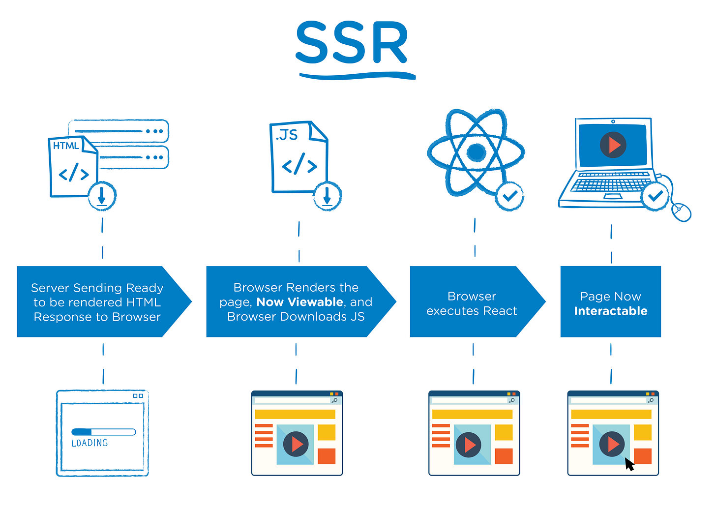
Server-side rendering was traditionally the most common method for displaying information onto the screen. It works by converting HTML files in the server into usable information for the browser. In this approach after a request the client receives a fully rendered HTML to display in the screen. One of the drawbacks of this approach is that every time you request new information in the site, instead of just re-rendering the small section affected by the information change, you have to request again the full HTML and re-render the whole site with the new data.
Client-side Rendering

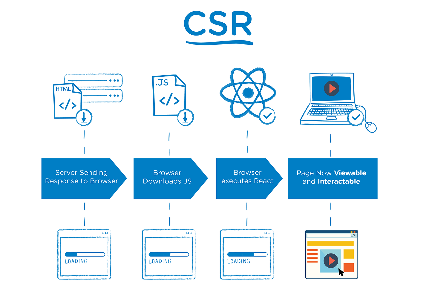
The client-side rendering approach popularized with the appearance of frontend frameworks such as Vue, React and Angular. In this approach instead of getting all of the content from the HTML document itself, you are getting a bare-bones HTML document with a JavaScript file that will render the rest of the site using the browser. This is radically different than using server-side rendering because the server is now only responsible for loading the bare core of the website, the main boilerplate. Everything else is handled by a client-side JavaScript library, with the corresponding increase in computational needs at the client’s device.
With this approach, when you navigate the site and request new information, instead of having to re-render the whole HTML with the new information, you just need to update the component affected by the change.
It’s all a trade-off, but server-side is returning.
So which approach is better? It depends. Each of them has its pros and cons. With server-side rendering, users receive a full HTML to render, and the computation required at their devices is minimum. But this comes at the expense of serving larger files (not a good thing in slow networks), and having to re-render the whole HTML for every new request (with the corresponding increase in the load of the server).
Client-side rendering, on the other hand, serves smaller files (as all the rendering work is done by the client’s device), and builds components one by one in the DOM. This rendering process relieves the load in the server, but increases the processing power required at client-side. CSR has, in my opinion, another UX annoying con, the loading flickering. As components are rendered one by one in the client, there a flickering effect in the loading process which is really annoying and that doesn’t happen in SSR, where the HTML is fully served and rendered.
However, as shown in the case of Walmart, some developer are starting to consider the use of server-side rendering while using frontend frameworks such as React in order to benefit from the incremental updates of the DOM performed by these frameworks, while loading in the server instead of in the client’s devices (it could be considered as a “kind of” hybrid approach). Rendering React in the server allows the cache of information (such as the basic DOM structure) to optimize the rendering of React component updates, making file serving more efficient. In this hybrid approach the files served by the server are a bit larger than in a pure-CSR approach, but it significantly relieves the computational needs of the client’s device (this is quite interesting considering how web applications are becoming more complex as the SaaS models thrive. Again, see the Walmart case for further information about this approach).
Minification
And one last easy scheme (probably known by everyone) that can significantly reduce the network use of your web application, Minification. Minification is the process of minimizing code and markup in your web pages and script files. It’s one of the main methods used to reduce load times and bandwidth usage on web apps. It will save networking resources from your clients and servers (consequently reducing your AWS bill :) ). Minification tools (such as UglifyJS) remove extra spaces and comments, they crunch variables names, in short, they do anything they can to slim your code while keeping it functional.
But how serious is this minification thingy? Well, to give you a quick example, just by minifying the last web app I developed, I managed to reduce the size of the files served to the client-side in a 50%. It is worth adding it to your toolbox, right?
Missed anything?
That’s all for today, folks! Hope you enjoyed this brief overview on different schemes to enhance your web development. I am no expert on this, so I may have overlooked other important schemes to better web app performance. If this is the case, I would love to hear from you in order to learn new ways of making our client devices lives better.
[Update] Code and Bundle Splitting
While re-exploring this matter, I found another great strategy to better the performance of your web app I missed while writing the publication: Code and Bundle Splitting. This great article gives a great explanation of what is this about.
Further reading:
Sophisticated Adaptive Loading Strategies from Tinder Web engineering
Serving Adaptive Components Using the Network Information API with Vue and Web Components

